ShopDreamUp AI ArtDreamUp
Deviation Actions
~ Special Supporter ~
Your support would mean a lot to me :)
Here you will find your picture, illustrations and much more, everything can be downloaded freely.
Support my work by contributing to my tip jar every month.
$1/month


Suggested Deviants


Suggested Collections


You Might Like…


Featured in Groups


Badge Awards
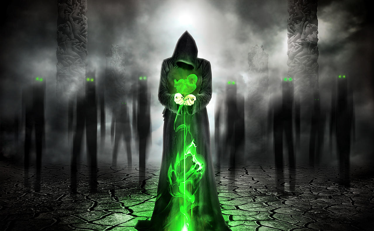
Description
Stock used:
Model fav.me/d6itgpw
Fetus fav.me/d6nw59
Columns fav.me/d7xx8kw
Textures:
www.cgtextures.com/
 resurgere.deviantart.com/art/i…
and personal stock.
Thanks for stopping by (Cool)")
Edited 10/27/2014.
Model
fav.me/d6itgpwFetus
fav.me/d6nw59Columns
fav.me/d7xx8kw Textures:
www.cgtextures.com/
resurgere.deviantart.com/art/i…and personal stock.
Thanks for stopping by
Edited 10/27/2014.
Image size
2200x1359px 1.82 MB
© 2014 - 2024 Vilk42
Comments20
Join the community to add your comment. Already a deviant? Log In
Overall the image is engaging from the thumbnail size. So that is an accomplishment in itself. The selective use of green only. Limits its impact. I would venture to say, if there was a larger variance in the green values. The background figures eyes wouldn't seem to settle on the same visual plane. They seam to hit the same line of sight. So if the differed in green value intensity they would separate from each other creating more space. Another item when using selective color, in the could layers. Had they received a touch of color, even slight like 15% of a contrasting orange/peachy salmon value. Even in the high key grey. The bit of chroma would push the black,white and grey along with an extreme push of the green. Im not talking super opaque orange just grey with a hint of it... I like the fetus graphic, but would like a bit more ambient light coming of it, to push it further into foreground. Over all, this image is striking, very well done. I am very picky about digital work. SO I might come off as, jerky. Not meant that way. Talent there! I think a bit of refining and this image would be through the roof....